Groupon Refresh

With a new user experience on the horizon and a new focus on high quality deals and merchants, it’s only fair that Groupon gets refreshed & modernized. To bring Groupon up to date, I’ve selected a high energy, vibrant green that promotes feelings of liveliness. I felt it was important to stay with green because of its instant brand recognition.
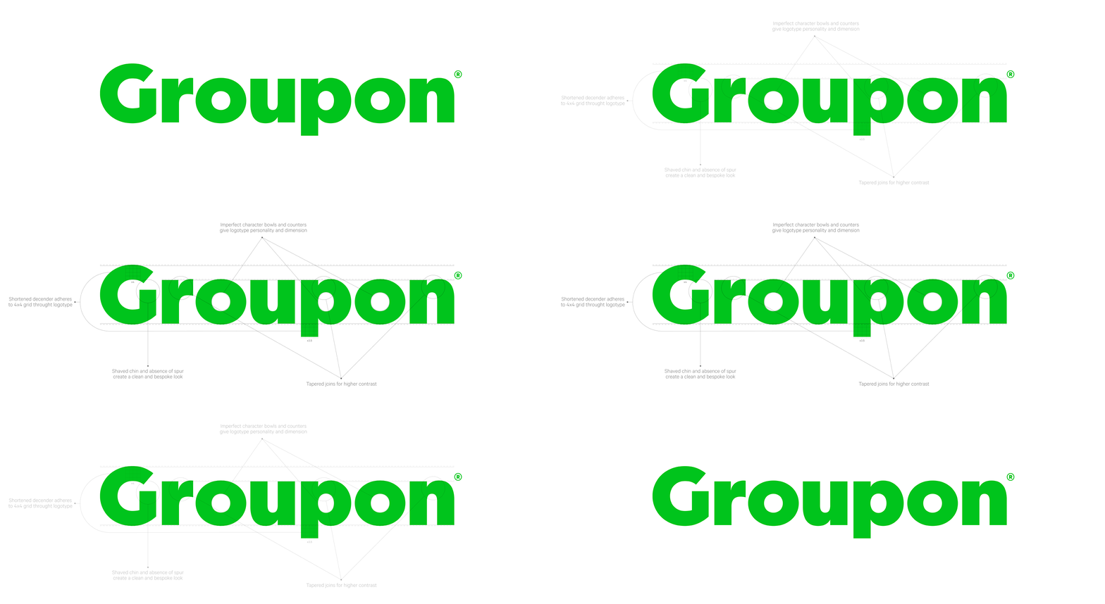
On top of the color change, I refreshed the logo as well. Built from Filson Pro, I customized the wordmark to best showcase the modern and fun Groupon.

External branding will be in green and black to promote consistency within the new brand, while internal branding will be less restricted due to our familiarity.

This simple color palette was designed to keep our new user experience and hand selected deal card images at the forefront of our brand. The idea is to minimize branding noise, and maximize eyes on our deals.


Here are some examples of how Filson Pro would look. In different sizes and treatments.

Groupon empowers you to conquer your fears, push your limits, seek thrills, take part in trends, and have a damn good time. Our images show that by displaying subjects that are in an exciting and eventful moment.

Email postcards living under this visual ID will differentiate brand and merchandising emails.

Site assets utilizing our new photography + type guidelines.


